Plotting & Visualization
From Database to Dashboards
This guide walks you through visualizing your experiment results—from raw data stored in PostgreSQL to interactive Grafana dashboards.
Step 1: Update Your Data in PostgreSQL
Our data pipeline uses PostgreSQL as the backend database. To sync your experiment results, simply run make sync-pg or explore the available PostgreSQL commands and client tools to understand what operations you can run.
Step 2: Visualize Results in Grafana
Once your data is persisted in PostgreSQL, head over to Grafana:
Access point: Port 4000 on your local machine
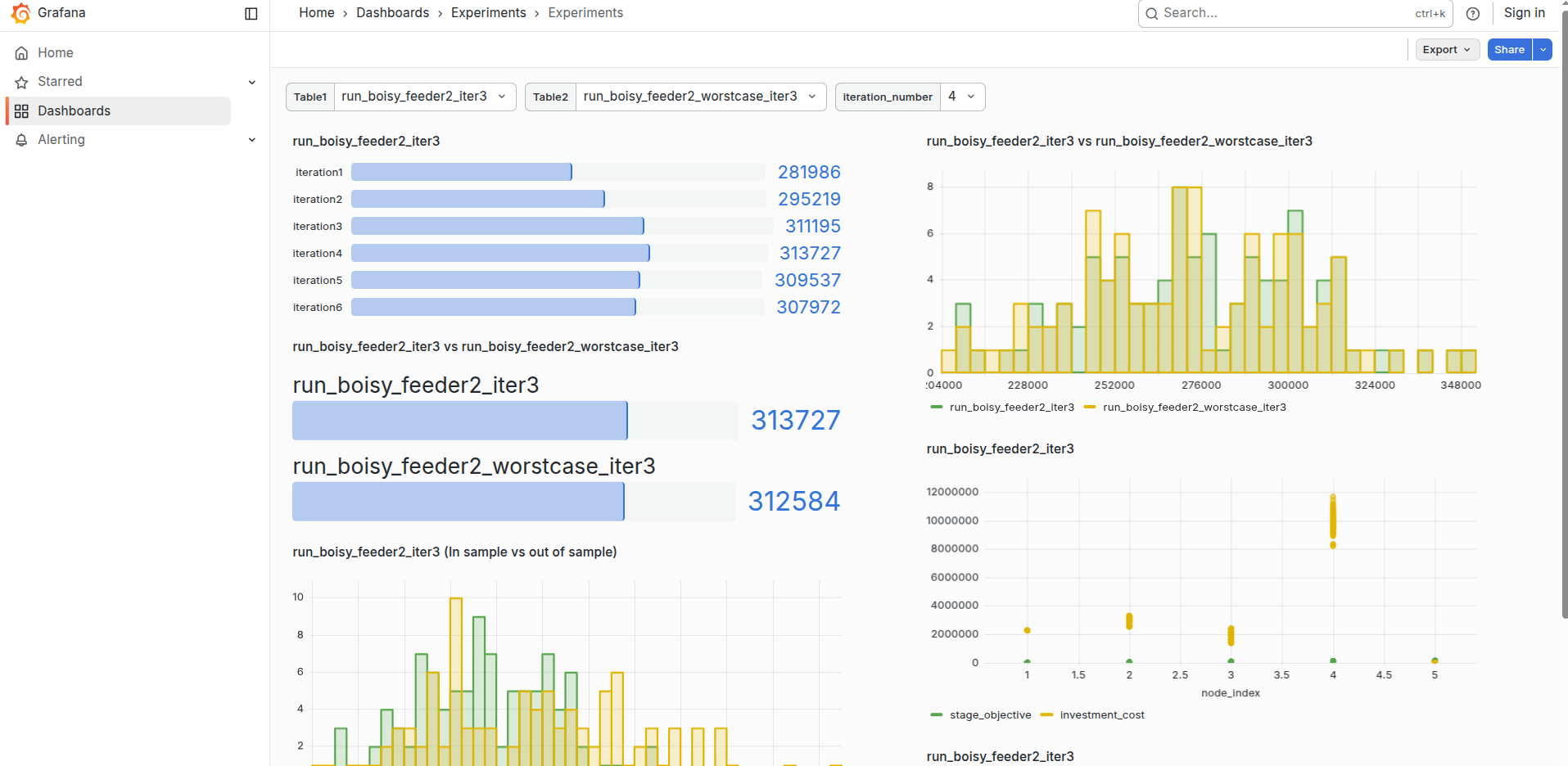
Navigate to: The “Experiments” dashboard
What you’ll find: Real-time visualizations of your experiment metrics and results
Auto-Generated Dashboards
The beauty of this setup is that dashboards are automatically generated based on your experiment selections. Simply choose which experiments you want to analyze, and Grafana will produce tailored visualizations without manual dashboard creation.
Workflow Summary
Data Flow: JsonFiles (json files) → PostgreSQL (data storage) → Commands/Client (data updates) → Grafana (interactive visualization)